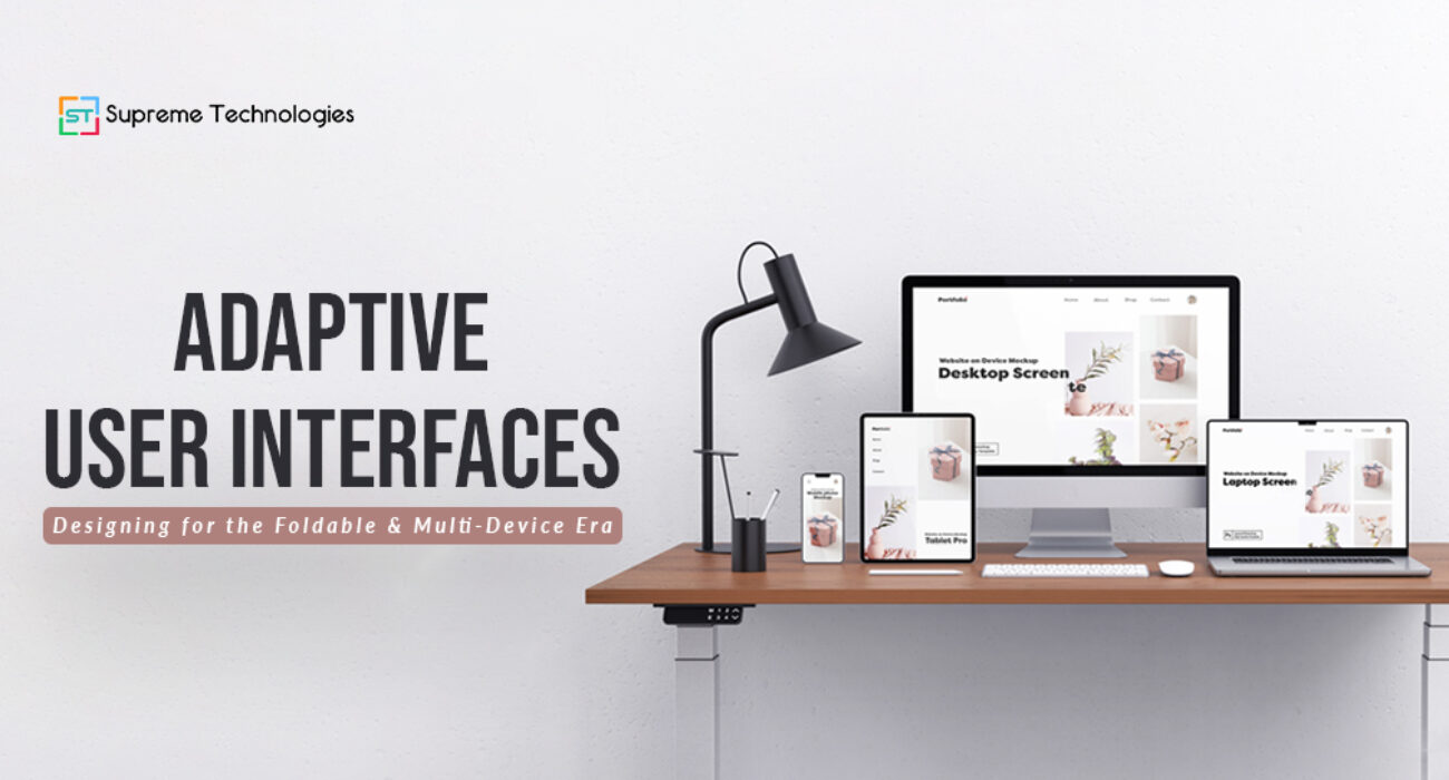
The digital landscape has evolved significantly over the past decade, pushing the demand for adaptive user interface design across multi-device user experiences. This change is driven largely by technological advancements in device capabilities and user expectations. As smartphones, tablets, desktops, and foldable devices become ubiquitous, businesses must evolve their digital platforms. They need to deliver exceptional user experiences across a variety of screens and devices. Moreover, adaptive User Interface (UI) design is at the forefront of this transformation. It allows businesses to craft digital experiences that are flexible, context-sensitive, and optimized for a multi-device world.
In this article, we explore the concept of adaptive UI design and its key elements. These elements offer several benefits to businesses seeking to remain competitive in the foldable and multi-device era. Additionally, we will examine how adaptive UIs differ from traditional responsive designs. We will also discuss why businesses must prioritize them in the modern digital ecosystem.
What is Adaptive User Interface Design?
Adaptive UI design is a dynamic approach to creating user interfaces, utilizing context-aware interfaces that adjust based on user behavior and device type, including foldable devices and mobile screens. These interfaces adjust based on the context in which they are used. This includes factors such as device type, screen orientation, user behavior, and even the environment in which the device is being used. In fact, unlike traditional static or responsive designs, which rely on predefined grids and screen size adjustments, adaptive UIs are far more intelligent. They respond to the specific needs of the user at any given moment.
Key Differences Between Adaptive UI and Responsive Design
While both adaptive UI and responsive design aim to improve the user experience across multiple devices, there are key differences between them:
Responsive design: It uses flexible grids and CSS media queries to resize and adjust content according to the screen size, but adaptive UX patterns go further by tailoring the interface to a multi-device user experience. This ensures that a design looks good across all devices by adjusting layout elements as needed.
Adaptive UI: Takes responsive design a step further by tailoring the interface to different devices and user contexts. It adapts the layout and features not just based on screen size, but also device type, screen resolution, orientation, and the user’s real-time needs.
The Need for Adaptive UI in the Foldable & Multi-Device Era
As consumers use multiple devices throughout the day, from smartphones to desktops to foldable devices, the need for responsive design evolution and adaptive UX patterns to provide a seamless experience has never been greater. Consequently, users expect a consistent experience across all platforms. Adaptive UI makes that possible by recognizing the differences between devices. It provides customized layouts, functionality, and content that cater to those differences.
Why Traditional UI/UX is Not Enough Anymore
Traditional UI/UX design was mainly created to be viewed on a desktop and later on a smartphone. But these old methods don’t cut it in today’s multi-device universe. An unpredictable foldable product like the Samsung Galaxy Z Fold or the Huawei Mate X calls for a more flexible and context-based design. Also, individuals who switch between smartphones and tablets, and occasionally even desktops, are looking for an experience that is seamless and useful on each of those devices.
Trends in Foldable Device Growth
The foldable smartphone market is expected to represent between 15 and 20 percent of the total smartphone market in just six years, if recent industry reports are anything to go by. There have been more than 50 million units sold. As such, this surge underlines the importance for companies to update their digital platforms. The need to handle foldable and multi-device worlds is such that users would have a consistent and optimal interface, regardless of the device in their hands.
Key Elements of Adaptive UI Design
To create an effective adaptive UI, businesses must integrate several critical components, such as responsive design evolution and flexible layouts, into their design processes. These elements ensure that the UI responds not just to the device but to the context in which the user interacts with it.
Context-aware Interfaces
Context-aware UIs are the basis of adaptive UI design. They even allow UIs to react in real time to conditions, like device orientation, user preferences, environment, and even the time of day. As an example, on a mobile device, if the device is held in hand-held mode, the bounds of touch targets might be increased to ease user interaction. On a tablet or desktop, meanwhile, it might show more information, or show content in multiple columns to make the most of the larger screen size.
Multi-device User Experience
Today, connectivity across multiple devices is expected to be seamless. Users frequently switch devices, using smartphones to tablets to PC’s in the same browser session. In addition, adopting adaptive UI allows users to initiate a session on one device and continue it from where they left off on another.
For instance, a customer could write the initial draft of an email on their phone and complete it on their desktop without having to start over. Thus, this uninterrupted transition is an important factor in engaging users. It builds confidence among the users while interacting across devices.
Responsive Design Evolution
Responsive design is still a core tenet of making a modern website, but it’s not enough on its own. Otherwise, the transition from static layouts to dynamic and context-sensitive compositions defines the UI/UX development. Thanks to responsive design, web pages adjust according to screen size and resolution; however, they’re not dependent on device type or user actions. Adaptive UI, by contrast, takes these into account in order to provide a more customized user experience.
Flexible Layouts
Adaptive UI design and the importance of flexible layouts. They are an essential aspect of adaptive UI design. By employing flexible grids and elements, UI elements resize (and reflow), realign, or reshuffle to be adjusted to the screen size, orientation, and type of device. Consequently, that flexibility means anyone using the site, whether on a foldable smartphone or desktop monitor, will get an interface optimized for their device.
Challenges in Implementing Adaptive UI
While adaptive UI design offers numerous benefits, businesses face several challenges when implementing it effectively.
Technical Complexity
Creating adaptive UIs needs to be a complex coding and design exercise that considers the different screen resolutions, orientations, and user behaviors across multi-device user experiences. There are a lot of devices with different screen resolutions and orientations, and user behaviours to consider while developing. Therefore, this complexity dictates that an expert care and close-to-the-hardware considerations to make the adaptive interface work for all platforms.
Performance Concerns
Adaptive UIs can be more costly in terms of resources than traditional designs. Indeed, tools such as foldable mobile phones could potentially have difficulty analyzing the moving parts in a robust UI element if it is not at its peak performance. Businesses must, therefore, invest in strategies that optimise performance and decrease load times.
Maintaining Consistency
Consistency is one of the factors for developing a coherent brand experience. As a result, when dealing with responsive UIs, the business has to be sure that the brand’s visual identity and design guidelines are respected on any device. Keeping a coherent experience between different devices in portrait and landscape, etc., while also offering each layout the ability to take advantage of its particular context, takes careful planning and testing.
Benefits of Adaptive UI for Businesses
Implementing an adaptive UI can have a significant impact on a business’s bottom line. Here are some of the primary benefits of adopting adaptive UI design:
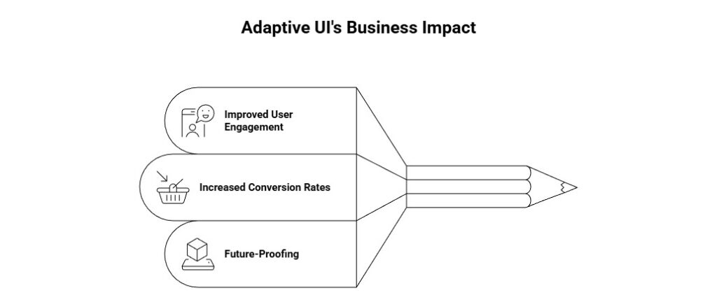
Improved User Engagement
Adaptive UIs strive to increase user interaction, offering a personalized experience. Customized User Experience. By customizing the interface with regard to the user’s device, situation, and behavior, companies can provide an intuitive and satisfying experience that lets a user stay for longer periods of time.
Increased Conversion Rates
When people face a highly device- and context-optimised UI for their needs. They’re more likely to carry out the desired actions, be it buying something, signing up for a service, or downloading an app. So adaptive UI design creates more fluid interactions, decreasing friction and increasing conversion.
Future-Proofing
Adaptive UI buses advance the business’s cause as the number of devices is on the rise, so, too, will any new technological advances. Be it the emergence of foldable devices or the proliferation of newer UI technologies, adaptive UI makes sure that businesses stay agile and are able to respond to future trends.
Also read: Woocommerce Vs Shopify: Best Choice for Dallas Small Businesses in 2026
Best Practices for Crafting Adaptive UIs
To successfully implement adaptive UI, businesses must follow a set of best practices that prioritize both design and functionality.
Prioritize User Context
Design with the user’s context in focus. It is very important. A UI needs to be responsive not just to the device, but to the user’s environment, constraints (physical or cognitive), history, and habits. This means thinking about what the device can do, where the user is, and how they are likely to behave with this content.
Modular Design
Reuse UI components across different contexts with a modular approach to design. If they can break down their machine into modular parts that will fit on screens of varying size or orientation. Then they’ll be able to save themselves time and effort. While maintaining the continuity of experience that we build in our development process.
Responsive Typography and Scalable Components
Text and elements must be scalable to ensure they’re legible and functional on all devices. In addition, designers must implement approachable and flexible patterns where text is readable. Buttons are clickable, and the layout remains consistent across varying devices.
User-Centered Testing
Testing is Fundamental to Adaptive UI Design. We do regular user testing as well to make sure everything is still fluid at the adaptive level. By iterating on design and soliciting feedback, companies can gradually improve the user experience.
Real-World Examples of Adaptive UI Design
Several businesses have successfully implemented adaptive UI design to improve their multi-device user experience and drive better outcomes. Especially by enhancing their responsive UI design for foldable devices.
Case Study 1: Business App
A leading business app embraced adaptive UI design to reach customers on smartphones, tablets, and desktops. The platform has seen user retention rise by 30% as a result. A user’s place and interface on a device were not interrupted or suffered from issues when transitioning devices.
Case Study 2: E-commerce Website
An e-commerce site redesigned its mobile interface to be foldable-ready. As a result, it saw a 40% boost in mobile conversion rates. The team crafted a unique, tailor-made design that allows users to snap in and out of the mounting pole while keeping their desired positions. No extra viewing stand or holder is required.
Conclusion
Responsive UI design is not just a fad. It’s an imperative aspect for businesses that aim to survive in a time when users want their way across devices. By using adaptive UI concepts, organizations can deliver context-sensitive user interfaces. These experiences, in return, satisfy the user’s needs and help to convert well. So, the time is now to future-proof your business with responsive design. Ensuring that your digital presence looks good, works well, and is easy on mobile, tablet, and desktop.
Ready to enhance your digital experience with adaptive UI design?
Contact Supreme Technologies today to discover how our cutting-edge solutions ca
1 Comment
Comments are closed.