Every day, US businesses generate staggering volumes of data. Sales figures, customer behaviors, supply chain metrics, and financial performance indicators, the list grows longer and faster each year. Yet for many organizations, that data sits trapped inside spreadsheets, disconnected systems, and dense reports that nobody reads. As a result, the result is not just wasted potential. It costs real money.
According to Gartner (2024), organizations lose an average of $15 million annually due to poor data quality. Furthermore, US businesses collectively forfeit an estimated $1.2 trillion per year because of ineffective data communication and dirty data. Consequently, when decision-makers cannot see and understand their data clearly, they make slower, costlier, and riskier choices.
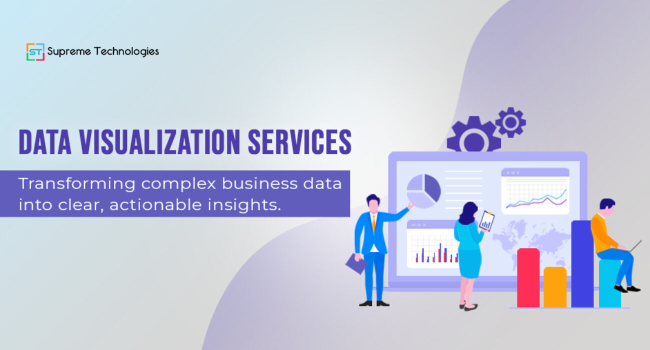
For this reason, a professional data visualization service steps in. By transforming complex datasets into clear, interactive, and visually compelling formats, these services help businesses move from confusion to clarity, and from raw numbers to real business action. Therefore, this article explores what data visualization services involve, why US companies are investing heavily in them, and how to choose the right partner for your organization.
1. What Is a Data Visualization Service?
A data visualization service is a professional offering that transforms high-volume, complex datasets into graphical representations such as charts, maps, dashboards, and infographics, designed to simplify interpretation and enhance decision-making.
Moreover, unlike basic reporting tools, a full-service solution spans the entire analytics lifecycle, from initial data exploration and model validation to the communication of final insights to executive stakeholders.
Beyond Charts and Graphs
Many people associate data visualization with simple bar charts or pie graphs. However, the reality is far more sophisticated. Modern data visualization services deliver dynamic, interactive environments that let users filter, drill down, and explore data in real time.
In addition, they combine data engineering, UX design, and business intelligence to create systems that serve both frontline analysts and C-suite executives.
Core Components of a Professional Service
A complete data visualization service typically includes the following components:
Data Integration: Robust ETL (Extract, Transform, Load) pipelines to ingest and clean data from multiple sources, ensuring accuracy and consistency.
Visual Design Layer: Dashboards, heatmaps, scatter plots, Gantt charts, and custom visualizations that highlight correlations, trends, and bottlenecks at a glance.
Interaction Layer: Dynamic filters and drill-down capabilities that allow users to explore specific data segments while removing noise and irrelevant information.
Ongoing Support and Iteration: Continuous refinement based on user feedback, data changes, and evolving business priorities.
2. Why US Businesses Are Investing in Data Visualization
The demand for data visualization services is accelerating at a remarkable pace. In fact, the global data visualization market stands at $10.92 billion in 2025 and is projected to reach $18.36 billion by 2030, growing at a CAGR of 10.95%. For US enterprises, consequently, this investment reflects a fundamental shift in how business intelligence is consumed and acted upon.
The Cost of Poor Data Communication
The financial consequences of inadequate data communication are well-documented and significant. Consider these figures:
- Organizations lose an average of $15 million annually due to poor data quality.
- US businesses forfeit an estimated $1.2 trillion per year due to dirty data and ineffective communication.
- Employees spend up to 27% of their time correcting bad data or resolving ambiguous communications.
These are not abstract numbers. Rather, they represent missed opportunities, delayed decisions, and eroded competitive advantage, all of which a strong data visualization service is designed to address directly.
The Competitive Advantage of Visual Intelligence
The investment case is equally compelling from a performance standpoint. In fact, research shows that 65% of executives consider data visualization crucial for their decision-making process.
Additionally, companies that actively apply visualization techniques report a 10% to 15% increase in overall operational efficiency.
Across industries, the impact is clear. Retailers use visualization to optimize inventory forecasting. Similarly, healthcare organizations monitor patient outcomes and resource allocation in real time. Financial institutions deploy business intelligence dashboards for fraud detection and risk modeling. Meanwhile, logistics companies track delivery performance across global networks. In every case, the ability to see data clearly translates into faster, smarter decisions.
3. Key Features of a High-Impact Data Visualization Service
Interactive Data Visualizations
The most impactful data visualization services move well beyond static reports. Specifically, interactive data visualizations allow users to filter datasets, zoom into specific timeframes, toggle between views, and surface the insights most relevant to their role.
This interactivity reduces the time business teams spend on manual data analysis by up to 30%.
More importantly, interactive visualizations increase data adoption across an organization. When people can explore data themselves rather than waiting for a scheduled report, they engage with it more frequently and with greater confidence.
Business Intelligence Dashboard Integration
A high-quality business intelligence dashboard connects your existing data infrastructure, from CRM systems and ERP platforms to cloud data lakes and third-party APIs, into a single unified view. Notably, leading platforms such as Microsoft Power BI, Tableau, Qlik, and Looker collectively hold approximately 74% of the total BI platform market share as of 2025.
Professional data visualization consulting services help organizations select, configure, and integrate these tools into their existing technology stacks. Importantly, the goal is not just to deploy a tool but to create an environment where every department, from sales and finance to operations and marketing, can access the metrics that drive their decisions.
Furthermore, real-time capability is now a baseline expectation: 76% of enterprises state that real-time data analytics is essential for business performance.
Data Storytelling for Enterprises
Numbers alone rarely change behavior. Instead, data storytelling for enterprises is the practice of combining visual elements with narrative context to guide decision-makers toward specific conclusions and actions. Rather than presenting a wall of metrics, effective data storytelling layers in annotations, benchmarks, and guided insights that help executives understand not just what the data shows, but why it matters and what to do next.
As a result, McKinsey (2025) identifies data storytelling as a critical enabler of a data-driven culture, noting that organizations that invest in translating analytics into clear narratives achieve stronger cross-functional alignment and faster execution.
4. Analytics Visualization Tools: What to Look For
Must-Have Capabilities
When evaluating analytics visualization tools, US enterprises should prioritize the following capabilities.
Scalability is essential, referring to the ability to handle growing data volumes and increasing user loads without performance degradation. Real-Time Data Processing comes next, meaning live connections to data sources for up-to-the-minute insights. Cross-Platform Accessibility ensures dashboards and reports work seamlessly on desktop, tablet, and mobile devices.
Security and Compliance must also be a priority, as enterprise-grade access controls, data encryption, and audit logging are critical for regulated industries such as finance and healthcare. Finally, AI Integration is no longer optional. By 2025, smart workflows and AI-driven data interactions are expected to be standard in corporate environments.
Popular Data Analytics Visualization Tools Compared
The four dominant platforms in the US market each offer distinct strengths. Microsoft Power BI holds the largest individual market share at approximately 21% (Global Growth Insights, 2026). It integrates tightly with Microsoft 365 and Azure, making it a natural fit for organizations already in the Microsoft ecosystem. Salesforce Tableau follows with roughly 14.8% to 17% market share.
It excels in visual analytics and is widely used by enterprise teams for exploratory analysis. Qlik and Looker Studio round out the top tier, offering strong associative analytics and cloud-native capabilities, respectively.
The right tool depends on your existing infrastructure, team skill sets, and specific use cases. Therefore, a professional data visualization consulting service helps organizations avoid costly mismatches by aligning tool selection with business requirements from the outset.
5. The Role of Data Visualization Consulting Services
Why In-House Teams Often Fall Short
Many US organizations attempt to build data visualization capabilities entirely in-house, only to encounter significant barriers. Tool complexity, integration challenges, and design skill gaps slow implementation and reduce the quality of final outputs.
Critically, 70% of employers now rank communication and data-literacy skills as more important than purely technical skills for analytics project success, yet these competencies are the hardest to build internally.
Beyond skills, bandwidth is a persistent challenge. Internal data teams are often stretched across multiple priorities, making it difficult to deliver the depth of analysis and the quality of design that enterprise stakeholders expect.
What a Consulting Partner Delivers
A professional data visualization consulting service brings strategy, implementation expertise, and a track record of measurable results. Specifically, the value extends across the full project lifecycle.
It begins with Discovery and Strategy, where the consulting partner takes time to understand your data landscape, business objectives, and user needs before a single dashboard is built. This is followed by Tool Selection and Architecture, recommending the right data analytics visualization tools and designing a scalable technical foundation that supports long-term growth.
From there, the focus shifts to Design and Development, creating visually compelling, user-tested dashboards and interactive reports tailored to your audience. Training and enablement come next, equipping your internal teams to use, maintain, and evolve the visualizations independently so the value does not disappear after the engagement ends. The process concludes with ROI Measurement, tracking the business impact of improved data access and faster decision cycles to ensure every investment is justified.
Consequently, the results are measurable. Businesses that utilize interactive dashboards built by expert consulting partners achieve up to a 38% increase in cross-departmental collaboration.
Also read: Generative Engine Optimization: How to Rank in AI‑Generated Search Results?
6. How to Choose the Right Data Visualization Service Provider
Key Evaluation Criteria
Selecting the right partner is a strategic decision. Therefore, the following criteria should guide your evaluation. Industry Experience matters first. Look for providers with proven work in your sector, as a firm that has delivered business intelligence dashboards for healthcare organizations understands regulatory and workflow constraints that a generalist may not. Technical Portfolio is equally important, so review real examples of interactive data visualizations and dashboards the provider has built, since the complexity and quality of past work are the strongest indicators of what you will receive. Tool Expertise must also be confirmed, meaning the provider holds certified expertise in the data analytics visualization tools you plan to use.
Infrastructure Capabilities are another key consideration. The best providers connect to diverse data sources, including cloud data lakes and external streams, and can deliver Data Visualization as a Service (DVaaS) for ongoing flexibility. Security and Governance should never be overlooked, so verify that the provider follows rigorous data security protocols and supports model explainability for AI-driven insights. Finally, Post-Delivery Support separates strong partners from weak ones. A strong provider does not disappear after go-live, as ongoing maintenance, training, and iteration are essential for long-term value.
Red Flags to Avoid
Not all providers deliver equal value. In particular, watch for these warning signs. Providers who lead with a One-Size-Fits-All Solution, pushing a specific tool or template before understanding your business, are prioritizing their own convenience, not your outcomes. Any provider that does not address data security, access controls, and compliance from the start introduces significant organizational risk through the absence of Data Governance Practices.
A missing Measurement Framework is equally concerning. If a provider cannot explain how they will measure the success of your investment, they likely cannot deliver it. Finally, Limited Transparency is a serious red flag. Top-tier providers distinguish themselves by moving beyond static reports to automated, predictive insights and by keeping clients informed at every stage.
Conclusion
Data is only as valuable as the decisions it enables. For this reason, for US businesses operating in an increasingly competitive landscape, the ability to see, understand, and act on data in real time is a genuine strategic advantage. A professional data visualization service does more than produce attractive charts. In fact, it connects your data infrastructure, empowers your teams, and transforms raw numbers into the clear, actionable insights that drive growth.
Whether you need a business intelligence dashboard to unify your operational metrics, interactive data visualizations to engage your executive team, or end-to-end data visualization consulting services to build a scalable analytics environment, the right partner makes the difference between data that collects dust and data that moves your business forward.
Therefore, Supreme Technologies is ready to help you unlock the full value of your business data. Contact our team today to explore how our data visualization services can turn complexity into clarity for your organization.
Visit us at supremetechnologies.us to schedule a consultation.
Frequently Asked Questions
Q1. What industries benefit most from data visualization services?
A: Virtually every data-intensive industry gains value, but the highest adoption is in financial services, healthcare, retail, and logistics. Notably, the banking, financial services, and insurance sector alone represents nearly 30% of business intelligence usage, with a primary focus on fraud detection and risk modeling.
Retailers apply visualization to inventory management and sales forecasting, while healthcare organizations use it to monitor patient outcomes and allocate resources efficiently.
Q2. How long does it take to implement a business intelligence dashboard?
A: Implementation timelines vary depending on the complexity of your data infrastructure, the number of data sources, and the scope of the dashboards required. Simple single-department dashboards can go live within a few weeks.
However, enterprise-wide implementations, particularly those involving AI and advanced analytics, typically run across multiple quarters. Notably, 33% of organizations are currently scaling their AI and analytics programs enterprise-wide.
Q3. What is the difference between data visualization and business intelligence?
A: Business intelligence (BI) is the broader discipline of collecting, analyzing, and presenting business data to support decision-making. In contrast, data visualization is a core component of BI. It is the layer that makes analysis visible and accessible to all stakeholders.
Specifically, a business intelligence dashboard is the primary vehicle through which BI insights are communicated visually. Think of BI as the engine and data visualization as the instrument panel that lets every driver read the gauges clearly.
Q4. How much does a data visualization consulting service cost?
A: Costs vary significantly depending on project scope, tool selection, data complexity, and the level of ongoing support required. As a useful benchmark, poor internal data communication costs organizations between $3,640 and $37,440 per employee per year (Axios HQ, 2025).
As a result, most businesses find that the ROI from a well-executed data visualization service significantly outweighs the investment, particularly when factoring in efficiency gains and faster decision cycles. For accurate pricing, request a scoped proposal from your chosen provider.
Q5. Can data visualization services integrate with existing tools like Salesforce or Google Analytics?
A: Yes. Integration with existing enterprise tools is a standard capability of professional data visualization services. For example, leading platforms such as Power BI, Tableau, and Looker connect natively with Salesforce, Google Analytics, HubSpot, SAP, and hundreds of other data sources.
The key is selecting a provider with demonstrated experience in your specific tech stack, and ensuring the integration architecture supports real-time data flows and appropriate security controls.